Tag Archives: interior

What colour to paint….a 3D sketch.

_DSF4812You can be forgiven for thinking this is a flat, two-dimensional sketch because that is exactly what it looks like.

When I followed a small sign through a plain looking door off Greek Street I wasn’t really sure where I was going or for what reason.

I’d stumbled upon a modest gallery with an interesting collection of exhibits, one of which played havoc with my eyes for a good few minutes. See above.

The piece is actually a sketch that was printed on a 3D printer and each ‘line’ is hung with a series of invisible threads from the ceiling. Even when the threads catch the light and logic dictates that what you are seeing is 3D you still have trouble trusting it. The sensation is a bit like one of those pictures that is both an old and a young lady, once you see one you suddenly can’t see the other. For that reason I took a few extra pictures to try and prove the additional dimension but it’s still a push for the brain – especially on a Sunday!

_DSF4810
_DSF4811


Leave a comment

Filed under Inspiration

What colour to paint…lighting.

I suddenly feel like it’s getting darker. Last time I checked it was still light at 11pm so how is it now dark at half 8?

I don’t mind it getting darker, in fact I quite enjoy it. I like being cosy with a bit of ambient light whilst it’s dark and rainy outside. I like the way ambient light makes things look, colours seem softer, faces less weathered.

This might be why I enjoyed the rapid increase in the lighting selection throughout Paris and London design week. Colour plays an interesting part too, whether in the material, the bulb or the effect on the colour of surrounding objects.

I think we have advances in LED technology to blame for this. Thanks to them lights and lighting are being reconsidered, whether they are using the technology or not.  I have compiled montages of some of the most interesting lights I found….


lighting4

There were a lot of designers having fun with light, I particularly enjoyed the table light (bottom right) that your drink becomes part of when you set it down on the coaster. Origami, frosted matt glass, jars, tumblers and excess printer cartridges were all recognisable influences but my favourite is still the cuddly chandelier that looks like it has been made from flamingoes.

lighting 2

The image to the left is from Design Junction. It is filled with ceramic shapes that both diffuse the light and draw you to it. Bottom right is a light that blows bubble. Yes a bubble light – the bubble grows until it pops and then another forms – strangely addictive and it is almost impossible not to reach out and pop the bubble as you watch it.

lighting 1

Above we have Sebastian Wrong for Hay – displayed in a beautiful private Georgian Residence, the modern shapes were  perfectly juxtaposed against the traditional decor. Other examples show light incorporated into furniture and the wicker, outline and knitted trends we’ve been seeing.

lighting5

Another favourite on my ‘how to create ambient light’  list is the old classic, the candle. Maison offered the virtual candle that slowly burns down on the screen of your tablet as well as the LED flame that mimicked the movement of a flame surprisingly accurately. Design Junction, 100% Design and Tent bought us the latest in candle stick chic, with stackable wooden pieces, simple monochrome and slick glossy geometrics. The Poundshop (there is a pop-up store in Selfridges at the moment) also had some unique candle based treats including concrete look tea light holders and a pop and click make it yourself wood and cooper number.
lighting3

This installation at Maison et Objet in Paris encouraged visitors to walk towards a beam of coloured light in an otherwise completely pitch black room. Despite barely being able to see, visitors were entranced by each colour and shape the projector offered up. Even though it tells you not to look straight at the light source I just couldn’t help it – why is that?!!

Hope that provided a bit of ‘light’ relief.

Leave a comment

Filed under Ideas, Inspiration

What colour to paint…Paris design week – the best bits.

Planes, trains, buses, boris bikes and my faithful feet have all taken a beating as I trawled the shows and events at Paris Design week and London Design Festival with a little bit of London Fashion week thrown in for good measure!

This is the first post of several bringing you my best bits.

Let’s start with Paris.

I love visiting Paris, as soon as I stepped off the train I got my favourite Paris feeling – the one where the extraordinary is suddenly more likely and magic actually exists. After eating my own weight in croissants and that delicious french bread with strawberry jam I felt ready to take on Maison et Objet, from there I headed to Perishing Hall off the Champs Elysees for a presentation. I scoured St Germain and made my way to the docks to see Now!Le Off, a small show full of emerging design talent.

Below you will see two of my favourite examples of elastic storage – as seen at Now!Le Off, these two pieces combined natural pale wood with neon/bright elastic to give flexibility and support for any objects you wish to store.photo[5]photo[6]

The strength of the digital world’s influence is evident in this piece of furniture where craftsmanship and tradition meet pixels! photo[8]

I saw this inky pattern on anything and everything, especially in this season’s appropriate inky blue! This is a step on from the painterly water colour trend we’ve seen over the past few years. It also represents a softening in some of the graphics we’ve been experiencing.
photo[2]

Marquetry. Where did it go? Not that it matters…..because its back! Seen below with strong geometric shapes, the age old craft has returned and is being used in new and interesting ways. The honey tones and hues of the wood being key in order to create maximum impact through complex patterns. photo[4]

I saw a real trend for up lifting basic objects (eg. potato peelers made from gold) but this example turned that theory on it’s head giving the classic chandelier, a comic and fun twist – colour and material playing an obvious roll in the transformation.
photo[3]


These images represent about 0.1 % of the wierd and wonderful pieces I saw but fear not! Design Junction, Tent, Decorex, Focus and much more still to come!

1 Comment

Filed under Ideas, Inspiration

What colour to paint…setting plaster pink.

There’s been no hiding from ice cream pastel tones this summer, and it’s not that I don’t like them, I just find them a bit too sickly sweet en masse.

I love aqua tones for their calming and soothing properties and I’m currently favouring a pink, not that sugared almond pink but one the colour of setting plaster, a pink with the very slightest addition of yellow.

It therefore pleased me to see the below palette in this month’s Elle Decoration.
IMG_4589

They’ve added grey to the mix  that not only balances and grounds the lighter shades but also knocks a bit of the ‘girlyness’ out of it. My instinct would be to add one or a mix of concrete, brushed steel and naturally weathered wood, all incredibly warm materials when paired with these hues. This is Elle Dec’s interpretation of the palette in an interior:

IMG_4590And….a tad less professional, this is mine…IMG_4588It’s my nearly updated spare room and given it’s size and my somewhat lacking photography skills it is difficult to make it look as nice as it feels to be in but I can assure you there is a wall clad entirely in grey weathered wood and an ombre effect painted 1940’s wardrobe just behind me!

If you are like me and want to avoid girly princess at all costs but like the gentle qualities of these tones, adding small copper accessories will instantly give your room a contemporary feel. Using a range of sheen levels from chalky matt to full gloss will also add interest.

4 Comments

Filed under Ideas, Inspiration

What colour to paint…Red.

IMG_4487

I paid my first visit to Shepton Mallet Flea today.

In hindsight, it may not have been the best idea to visit an outdoor flea market on a day as hot as this. I was there to buy a large quantity of interesting objects for work and for some reason the most interesting objects (like the anchor and 30cm solid iron set of keys) were also the heaviest.

Being fair skinned I topped up on the factor 50  (my red face was purely down to endurance weight lifting in the heat rather than sun burn) but was continually surprised by the number of people who clearly hadn’t applied any suncream, which brings me on to the colour RED.

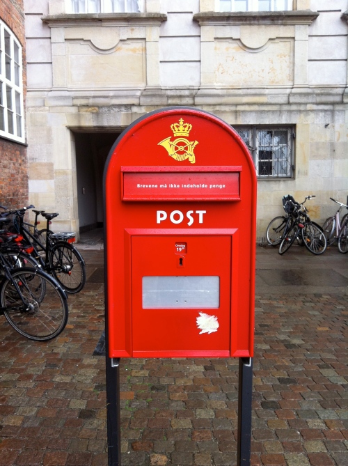
I picked out the burnt faces far more than any others. Red is a colour to get you noticed.

Red is associated with a wider variety of emotions than any other colour, it covers both positive and negative from courage and excitement to anger and defiance. It has the longest wavelength and plays a trick on the eye to appear nearer than it is, perhaps explaining why it attracts our attention first.

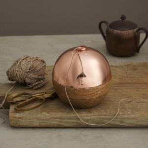
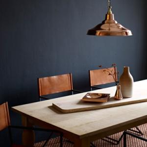
Often used to make a statement, red is not a colour to be used lightly as it is full of energy and is recognised as a stimulant so putting a bright shade in your home can put your room on high alert. Alternatively, using deeper or terracota tones can surround guests with a warm and cozy glow.  If you find a whole room a little daunting, several thoughtfully selected red accessories can give a similar energising effect.

Red is opposite green on the colour wheel so if you want even more vibrancy put them together – you’ll notice companies trying to sell red items often use a green prop somewhere in their photography to make the red pop even more!

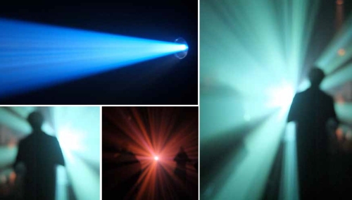
Here are a few red things to inspire…

IMG_3988

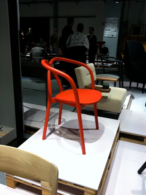
Chair as seen at the Tom Dixon ‘Most’ exhibit in Milan
IMG_3922

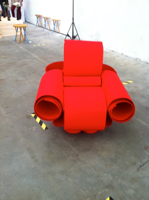
Found this in Lambrate in Milan.
DSC_0698

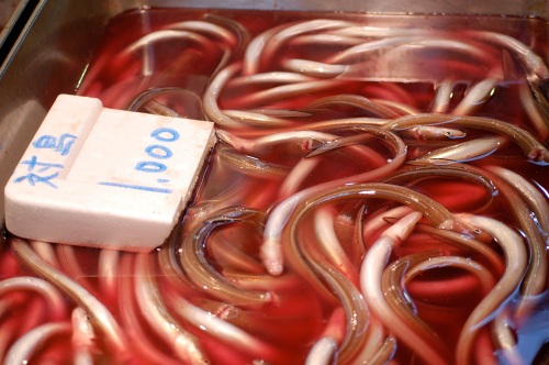
Red is always heavily linked with blood which reminded me of this picture I took at the Tokyo fish market.
DSC_0566

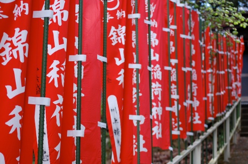
Beautiful flags from a trip to Japan.
DSC_0308

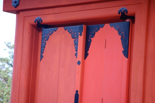
These doors are something else. Not sure why I only took a photo of half of them though…

DSC_0187

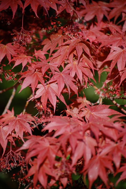
Japanese Acer (again from a trip to Japan).


DSC03247

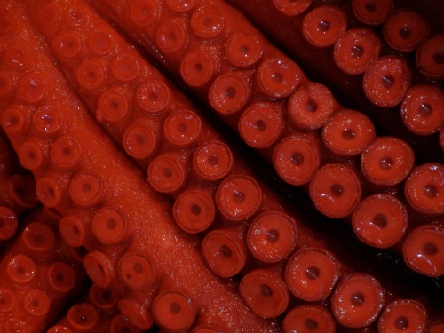
This is back at the fish market – what an intriguing tentacle!


In summary, if you want to make an impact you should definitely get caught red handed!

Leave a comment

Filed under Inspiration

What colour to paint…a tired foot stool.

IMG_3719I admit it. I’m a messy painter. I’m also impatient and really don’t want to put down dust sheets or wear overalls.

At 9.37pm yesterday I decided it was time to repaint my kitchen, so I grabbed my favourite brush and got going. No one apart from me would know I repainted it because it is nearly the same colour as it was before. I know and that’s all that matters.

The thing is, because I’m a messy painter, I dripped a bit on the floor. When I noticed I wiped it up with my finger but by that point I’d already trodden in it and left several other spots around the room. I sighed and put my hand on my forehead leaving another spot, wiped that off with the other hand…you can see where this is going.

The silver lining to my unintentionally decorated floor and face is that I was reminded of a foot stool I saw in Milan, covered in what appears to be finger prints of a similar colour to my kitchen.

What an easy way to update something plain you have grown bored with!

It is almost impossible to go wrong with a pattern like this as it is completely random and each finger print a different shape so there is no pressure or tiresome measuring to be done!

Bring out your inner child and get finger painting!

Leave a comment

Filed under Ideas, Inspiration, Make it Yourself

what colour to paint…copper.

copper

I’m not bothered by shiny things.

The few bits of jewellery I wear are antiqued to avoid it. I have nothing shiny in my house.

So can someone please explain why I am being drawn to copper?

Metallics, have been popular for the last 5 years and show no sign of tailing off, in fact, they seem to be gaining momentum with the addition of colour.

Colour trends are usually connected with social, demographic and economic factors and copper is no exception. Shiny things in particular are associated with wealth and excess and in times of economic difficulty we turn to colour to help us forget things are tough, hence the increase in metals. Gold and Silver have been used extensively and this will continue but they’ve been battling the economic crisis head on for too long so we find ourselves looking for something softer, warmer and friendlier and we find all those attributes in copper.

Copper is the first of these ‘coloured’ metallics to make the big time, shown above with wood it demonstrates how the underlying warmth of the metallic orange is the perfect partner for this natural material (image from  www.gardenista.com). Below gives a great example of how to incorporate in to your home through the use of several sheets giving a layered effect (image from www.dwell.com).
copper1

Blue and orange are opposite each other on the colour wheel and therefore make striking partners when featured together: this photo by Jake Curtis as seen at london.onerepresents.com with polished copper and dark navy is a great example.

copper3

One of my favourite things about copper is its natural green patina when left unpolished which is one of the reasons Architects and designers have coveted it for so long. Not only is the green beautiful it is also incredibly resistant to atmospheric corrosion, protecting the metal underneath it, perfect! Here’s an example from a recent trip to Copenhagen.

IMG_4473

I guess the sudden surge in copper products was the catalyst for me to buy the copper pencil skirt… have I worn it?…

Of course I have! In time I am hoping it will turn green and become completely waterproof!

Leave a comment

Filed under Inspiration

What colour to paint…Hay Denmark.

I have just returned from a trip to the home country of Hay. I was quite in love with the brand before I went but I can confirm I am now well and truly seduced to the point of no return.

Hay opened its doors in Denmark in 2002 and using a plethora of international designers, provides us with the simplest, most useful, effortlessly beautiful everyday items. Every piece, from furniture to stationary is synonymous with the Danish design ethic and colour palette, a combination of which gives a very soothing and peaceful living space. Sticking to soft neutrals, watery pastels, natural materials and the odd pop of neon it really is difficult to argue with. So I didn’t. I came back with everything I could fit in my hand luggage!


Image

‘Lup’ candle stick holder in cooper, the metallic of the moment, a present for a friend’s 30th.


Image

‘Gym Hook’ a stylish and useful present for my kitchen.


Image

‘Plisse’ archive folder, a fashionable present for my desk.


If you get the chance check out http://www.hay.dk for a list of local stockists.

Leave a comment

Filed under Inspiration, Uncategorized

What colour to paint…a bamboo hut.

DSC_0085This image makes me feel warm.

The rich honey glow from the herringbone woven panels, the quiet craft giving a gentle sketched feel, the worn paint work on the simple mint fan.

After a long day travelling to Laos the view of the ceiling from my bed, in my own bamboo hut, was just what I needed. Comforting and nourishing colours.

Rising from the bed however,  you are presented with primary red (and therefore energising) metal furniture:

DSC_0083Move from the furniture to the floor and you have a vivid cobalt blue vinyl.

Unbeknownst to the owner, these patterns, items and materials could have easily made an appearance at this year’s Milan Furniture fair but in this context were purely for function. Colour and design were given little consideration (this is a fact – I asked the owner) but somehow the very basic primary and natural colours echoed the primitive, basic shapes of the furniture and simplicity of the patterns giving the impression it had been carefully thought out.

What can we take from this to use in our homes? If you want to use many colours harmoniously in your home you should make sure each one has the same weight, i.e. if you use dark red and want a blue you should use a dark blue, a green with a pastel yellow should be a pastel green. Using colours in this way retains the flow through your home. The eye is naturally drawn to points of contrast, so limiting the contrast by sticking to the same level/weight of colour gives your home more balance and is therefore a more tranquil place to live.

DSC_0097

One final message from the wonderful hospitable lady who made me a cup of rose hip tea from scratch…
DSC_0084

Leave a comment

Filed under Ideas, Inspiration

What colour to paint…Sophie.


Screen Shot 2013-06-10 at 11.31.32

This is Sophie.

She’s not just any Sophie but the Sophie behind the heroic illustrations of Willy Walnut (www.willywalnut.co.uk).

The Sophie behind my girl crush.

The Sophie who loves colour and is currently fasinated with YELLOW.

Me: ‘So what is it about yellow ?’

Soph: ‘I love how yellow things make me feel, like unwaxed lemons which smell and taste great in and on anything. A very good friend of mine bought me a lemon holder for the fridge which is still very exciting to behold. I also have a very brand new old up-cycled raleigh bike which has been sprayed powder yellow in the exact same colour as my logo, and even has a green wooden pencil in place of the pump which looks bloody brilliant. The sun is yellow and when he has his hat on friends come out to play and summer is finally here.’

photo-12

Check out those wheels – you couldn’t fail to be happy when riding this!photo-11 The infamous lemon holder! (available to buy in Marks & Spencers)

Sophie has extended her love of yellow into the nursery she is currently preparing for the impending arrival of her first child. Wary yellow can be difficult to get right, Sophie chose to paint the walls in a pale grey with lilac undertones and add yellow through accessories. A primitive colourful rug on the floor with yellow running through it, a soft zig zag Anthropologie cushion and she has even commissioned some bespoke blinds with a yellow panel at the bottom.

How do you feel about yellow?

Leave a comment

Filed under People