Category Archives: Ideas

What colour to paint…hüttenpalast.

Two, maybe three, years ago I read about this hostel in a report about innovative use of space. The owners had taken on an old vacuum cleaner factory in Berlin and filled it with old style caravans and ‘cabins’.  I wanted to stay there.

Two, maybe three, years later  I had booked flights to Berlin and suddenly remembered all but the name of the hostel. Doh. Then I remembered it’s the 21st century and we have Google. Search: ‘cool hostel with caravans in Berlin‘ et voila! HüTTENPALAST (www.huettenpalast.de).

From the styling alone you can tell Hüttenpalast is located in the young and creative district of Neukölln. An eclectic mix of modern, mid century and damn right old furniture and bits and pieces gives this unique retreat a warm, homely feel- despite the industrial shell. The owners have cleverly positioned everything so whilst you feel you have your own space you are also subtly encouraged to socialise, should you wish.  The palette is mainly whites, greys and natural pale wood with injections of spirit through traditional ceramics and books combined with colourful patterned Ikea fabrics.

Take a peek for yourself…

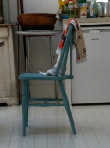
Ingenious use of an old door - definitely trying this one out!

Ingenious use of an old door – definitely trying this one out!

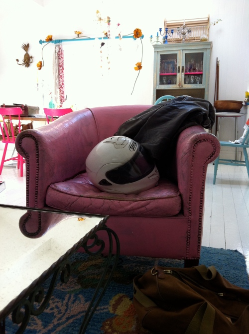
Cosy corner by our cabin.

Cosy corner by our cabin.

This cabin can sleep two people inside and two people on top.

This cabin can sleep two people inside and two people on top.

A great space for preparing for the day ahead or reading if it's tipping it down outside!

A great space for preparing for the day ahead or reading if it’s tipping it down outside!

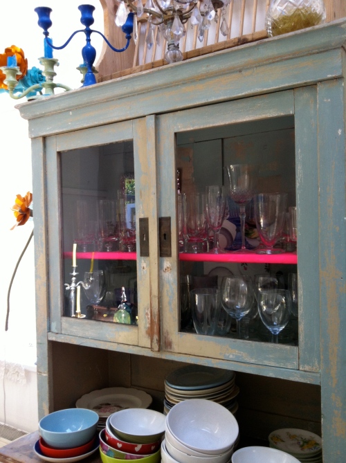
The cobalt blue of this shelf really gives this cow some standout.

The cobalt blue of this shelf really gives this cow some standout.

IMG_0076

These silver birch trees help with the outside inside experience!

IMG_0082

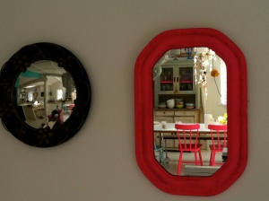
The classic mirror shot…

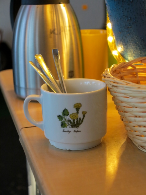
Wake up to morning coffee and mini crossiants, served under a tree central to the factory.

Wake up to morning coffee and mini crossiants, served under a tree central to the factory.

If my enthusiasm for this place still hasn’t sold indoor camping to you they also have private hotel rooms so you have no excuse not to visit!

HÜTTENPALAST is also a cafe and a garden space, if you happen to pop in for breakfast I would definitely recommend the granola with fresh fruit and yoghurt – it was bigger than my face and totally delicious! The staff were welcoming and incredibly helpful, recommending places to visit that were outside the usual list, one such recommendation led to a very interesting sauna experience…but that’s another story  ; )


Leave a comment

Filed under Ideas, Inspiration

What colour to paint…geometric update!


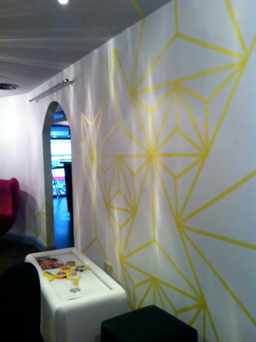
Not sure if anyone remembers but a while ago a masked a pattern on the wall of a bar…IMG_4580

This week I popped back to take a pic so as promised you can now have a look at the finished piece below! I used a series of cool greys neutrals in order to keep it clean and sophisticated, the varying tones creating a slightly 3D effect…
photo[3]

I’m off to Berlin this weekend – Yipee! – so will have plenty of beautiful images to share on my return!

Leave a comment

Filed under Ideas, Inspiration, Make it Yourself

What colour to paint…super cool doll’s houses.

As a child I was never drawn to the doll’s house.

Give me some materials (Lego, egg boxes, ice cream tubs, shoe boxes etc)  and I would make the doll’s house but didn’t really see the playing potential once built, unless it was to build another and another until I’d created a whole estate.

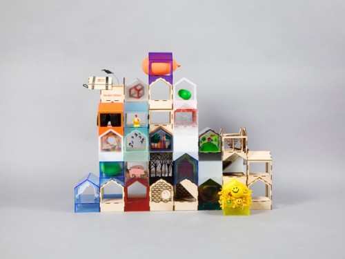
These doll’s houses are different. They were first exhibited at London design festival but I only found out about them by chance when a very good friend took the time to alert me of their existence.

They are not only different but off the miniature design scale.

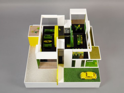
The master minds behind this project are the Cathedral Group who instructed 20 contemporary architects and designers, in collaboration with artists and other creatives, to design and build a contemporary dolls’ house. The dolls houses are being auctioned to raise money for the children’s charity KIDS (http://www.kids.org.uk/) so each creation includes at least one feature that makes life easier for a child with a disability.

You have until 11th November to make a bid with all funds going to an incredibly worthy cause. If you can’t afford your own house let alone one for a doll you should still take a peek – find a few to tempt you below…

all 20 can be viewed at http://interactivefundraising.co.uk/adollshouse/

domasAMODELS – Creative architectural model makers

 
make architectsMAKE ARCHITECTS-Award-winning international architectural practice


2b-large-600x450ALLFORD HALL MONAGHAN MORRIS -RIBA Award winning architects.


duggan_morrisDUGGAN MORRIS ARCHITECTS – In collaboration with Unit 22 Modelmakers


zaha hadidZAHA HADID ARCHITECTS – Internationally renowned, award-winning architects


All images from: http://interactivefundraising.co.uk/adollshouse/

Leave a comment

Filed under Ideas, Inspiration

What colour to paint…uplifted basics.

basics

I can’t lie, I get a strange satisfaction from peeling up to 7 potatoes so have come to appreciate the benefits of a good peeling tool. My current favourite has a ceramic blade with a standard looking black handle – plain, boring and peels like a dream.

BUT, have you ever seen a potato peeler and excitedly thought, ‘that would look GREAT in my utensils drawer’?

If so, it would appear you are not alone. ‘Uplifted basics’ was a key theme I noticed over the September design festivals. Simple, forgettable, everyday objects given an injection of the special whilst retaining their functional properties.

A few seasons ago the humble paper bag from French company Perigot (https://www.perigot.fr) was given a facelift with a block white stripe and upgrade to Tyvek (an incredibly durable paper used by the likes of couture designers like Hussein Chalayan). My uplifted basic of choice was to be found at Maison et Objet ; a shallow fruit crate with gold tinted mirrored sides – have a look at top right image in the tile above. The uplift can be achieved through colour, material and/or shape. Joseph Joseph, Aktion and Seletti are just a few of the bigger companies getting involved.

Following the economic crisis over the last few years we currently feel anything we spend money on should be an investment or a treat. This has encouraged designers to think about basic everyday items and add beauty to previously function driven products like the simple frying pan. Using a considered beautiful product makes the owner feel special so if it means I start to slightly enjoy mundane chores I’m not going to argue!

Leave a comment

Filed under Ideas, Inspiration

What colour to paint…lighting.

I suddenly feel like it’s getting darker. Last time I checked it was still light at 11pm so how is it now dark at half 8?

I don’t mind it getting darker, in fact I quite enjoy it. I like being cosy with a bit of ambient light whilst it’s dark and rainy outside. I like the way ambient light makes things look, colours seem softer, faces less weathered.

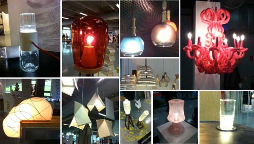
This might be why I enjoyed the rapid increase in the lighting selection throughout Paris and London design week. Colour plays an interesting part too, whether in the material, the bulb or the effect on the colour of surrounding objects.

I think we have advances in LED technology to blame for this. Thanks to them lights and lighting are being reconsidered, whether they are using the technology or not.  I have compiled montages of some of the most interesting lights I found….


lighting4

There were a lot of designers having fun with light, I particularly enjoyed the table light (bottom right) that your drink becomes part of when you set it down on the coaster. Origami, frosted matt glass, jars, tumblers and excess printer cartridges were all recognisable influences but my favourite is still the cuddly chandelier that looks like it has been made from flamingoes.

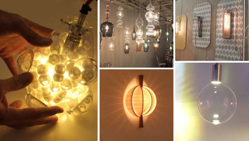
lighting 2

The image to the left is from Design Junction. It is filled with ceramic shapes that both diffuse the light and draw you to it. Bottom right is a light that blows bubble. Yes a bubble light – the bubble grows until it pops and then another forms – strangely addictive and it is almost impossible not to reach out and pop the bubble as you watch it.

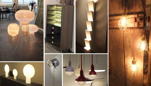
lighting 1

Above we have Sebastian Wrong for Hay – displayed in a beautiful private Georgian Residence, the modern shapes were  perfectly juxtaposed against the traditional decor. Other examples show light incorporated into furniture and the wicker, outline and knitted trends we’ve been seeing.

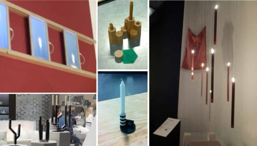
lighting5

Another favourite on my ‘how to create ambient light’  list is the old classic, the candle. Maison offered the virtual candle that slowly burns down on the screen of your tablet as well as the LED flame that mimicked the movement of a flame surprisingly accurately. Design Junction, 100% Design and Tent bought us the latest in candle stick chic, with stackable wooden pieces, simple monochrome and slick glossy geometrics. The Poundshop (there is a pop-up store in Selfridges at the moment) also had some unique candle based treats including concrete look tea light holders and a pop and click make it yourself wood and cooper number.
lighting3

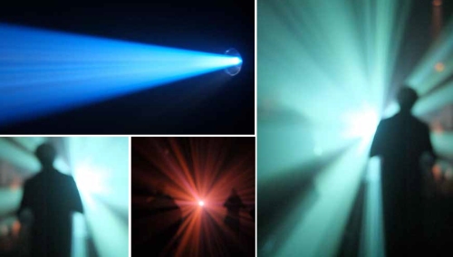
This installation at Maison et Objet in Paris encouraged visitors to walk towards a beam of coloured light in an otherwise completely pitch black room. Despite barely being able to see, visitors were entranced by each colour and shape the projector offered up. Even though it tells you not to look straight at the light source I just couldn’t help it – why is that?!!

Hope that provided a bit of ‘light’ relief.

Leave a comment

Filed under Ideas, Inspiration

What colour to paint…Paris design week – the best bits.

Planes, trains, buses, boris bikes and my faithful feet have all taken a beating as I trawled the shows and events at Paris Design week and London Design Festival with a little bit of London Fashion week thrown in for good measure!

This is the first post of several bringing you my best bits.

Let’s start with Paris.

I love visiting Paris, as soon as I stepped off the train I got my favourite Paris feeling – the one where the extraordinary is suddenly more likely and magic actually exists. After eating my own weight in croissants and that delicious french bread with strawberry jam I felt ready to take on Maison et Objet, from there I headed to Perishing Hall off the Champs Elysees for a presentation. I scoured St Germain and made my way to the docks to see Now!Le Off, a small show full of emerging design talent.

Below you will see two of my favourite examples of elastic storage – as seen at Now!Le Off, these two pieces combined natural pale wood with neon/bright elastic to give flexibility and support for any objects you wish to store.photo[5]photo[6]

The strength of the digital world’s influence is evident in this piece of furniture where craftsmanship and tradition meet pixels! photo[8]

I saw this inky pattern on anything and everything, especially in this season’s appropriate inky blue! This is a step on from the painterly water colour trend we’ve seen over the past few years. It also represents a softening in some of the graphics we’ve been experiencing.
photo[2]

Marquetry. Where did it go? Not that it matters…..because its back! Seen below with strong geometric shapes, the age old craft has returned and is being used in new and interesting ways. The honey tones and hues of the wood being key in order to create maximum impact through complex patterns. photo[4]

I saw a real trend for up lifting basic objects (eg. potato peelers made from gold) but this example turned that theory on it’s head giving the classic chandelier, a comic and fun twist – colour and material playing an obvious roll in the transformation.
photo[3]


These images represent about 0.1 % of the wierd and wonderful pieces I saw but fear not! Design Junction, Tent, Decorex, Focus and much more still to come!

1 Comment

Filed under Ideas, Inspiration

What colour to paint…setting plaster pink.

There’s been no hiding from ice cream pastel tones this summer, and it’s not that I don’t like them, I just find them a bit too sickly sweet en masse.

I love aqua tones for their calming and soothing properties and I’m currently favouring a pink, not that sugared almond pink but one the colour of setting plaster, a pink with the very slightest addition of yellow.

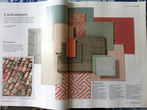
It therefore pleased me to see the below palette in this month’s Elle Decoration.
IMG_4589

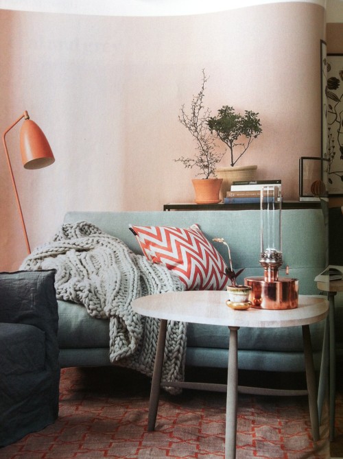
They’ve added grey to the mix  that not only balances and grounds the lighter shades but also knocks a bit of the ‘girlyness’ out of it. My instinct would be to add one or a mix of concrete, brushed steel and naturally weathered wood, all incredibly warm materials when paired with these hues. This is Elle Dec’s interpretation of the palette in an interior:

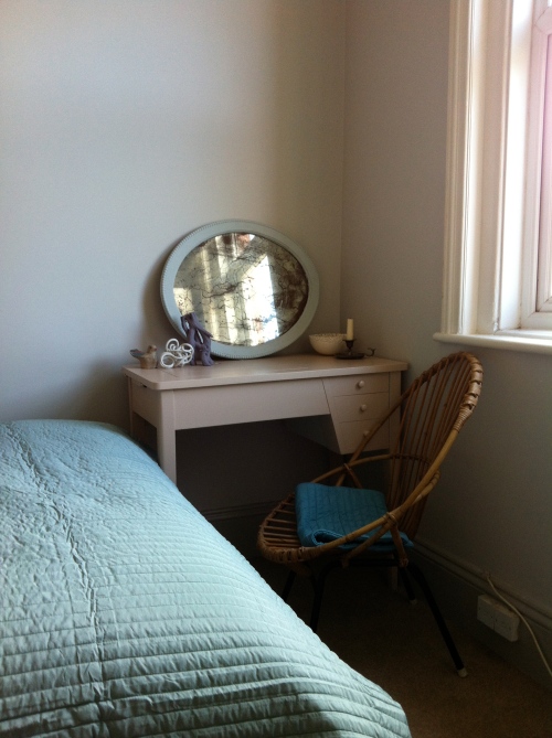
IMG_4590And….a tad less professional, this is mine…IMG_4588It’s my nearly updated spare room and given it’s size and my somewhat lacking photography skills it is difficult to make it look as nice as it feels to be in but I can assure you there is a wall clad entirely in grey weathered wood and an ombre effect painted 1940’s wardrobe just behind me!

If you are like me and want to avoid girly princess at all costs but like the gentle qualities of these tones, adding small copper accessories will instantly give your room a contemporary feel. Using a range of sheen levels from chalky matt to full gloss will also add interest.

4 Comments

Filed under Ideas, Inspiration

What colour to paint…a wall in a bar.


IMG_4579Through one person you meet another and through them you get a free membership to a members only bar in Tottenham Court Road.

You pop in to check it out, get chatting to the owner and suggest a few things he could do to liven the decor.

Next thing you know you have 6 rolls of masking tape round your wrist and a cheap tape measure from the corner shop in your hand.

‘Cool. Do what you want’ he says and goes to a meeting.

You wonder whether he actually meant it whilst thinking I’ll be late for dinner with Jess if I don’t get started…so you get started. Thanks to Mr Pythagoras, a few calculations later you’re up and running masking equilateral triangles (ok, as close as you can get to equilateral triangles) all over the place.

IMG_4580

Et voila….. a piece of wall art.

Each section is to be painted but I’d have never made dinner if I’d got involved with that so I’m awaiting an image of the final painted piece sans masking tape…will keep you posted!

The American Banksy equivalent did downstairs so I hope to God it looks hot because if not it will look super bad in comparison!!


Leave a comment

Filed under Ideas, Inspiration, Make it Yourself

What colour to paint…a stylist’s house – 5 ways to use paint in the home.

I was shooting exteriors this week and one of the locations was the home of a stylist.

I love visiting the homes of stylists because there are (usually) things to look at everywhere and the things to look at are always really interesting. This house was no exception and was full to the brim with the weird and wonderful, displayed with the confident nonchalance only stylists possess.

In just one room I witnessed over five ways to use paint and colour. Check some out below:

IMG_45671. Painting upholstery

This is literally a silk/eggshell finish paint straight onto leather, the cracking and patchy coverage adding to the effect.

IMG_45662. Half painting or ‘Dipping’

Painting (sprayed or brush) just part of the object with a different colour – can work straight on to a natural material or on to another colour as per the image. For stand out the colours need to be very different but for something a little more grown up subtle neutral tones on top of one another look great.
IMG_45713. Weathered and worn

Although the first thing you notice is the hot pink shelf the cupboard has a worn look – this can be achieved quickly through painting the piece in several layers of varying colour paint and then sanding back to reveal the different layers. Alternatively you can leave it for a few decades and this might happen naturally!
IMG_45564. Colour feature wall

Painted in a very crisp but homely white, this room (particularly when bathed in sunlight) makes you believe you are near the sea rather than in north London. Adding pops of colour like this bright turquoise takes the edge off slightly whilst adding lots of personality.

IMG_45725. Painting a feature

Using colour to pick out features – could be a period feature, a fireplace or something as simple as a door frame – as above!

Here are a few other examples of the painted furniture in the house, the colours are fresh and bright and add to the light airy feel the white creates, the owner’s sense of fun comes through clearly and you feel like you should be laughing and relaxing with friends when you’re in this space.

Enjoy!

IMG_4557

IMG_4555

IMG_4570

IMG_4568

Leave a comment

Filed under Ideas, Inspiration, Make it Yourself, Uncategorized

What colour to paint… a contemporary dado.

I work with paint so every time I see something that has been or could be done with paint I immediately want to try it.

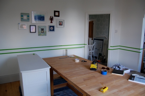
On this particular occasion I noticed how a cafe in Paris had used a striped fabric to create a contemporary dado rail. So upon my return I established which room in my house would be appropriate to experiment with. The dining room. I found a friend to loan me a laser level and got out the masking tape – see below.

DSC_0454

As a brief aside; it’s funny how the human eye can be tricked so easily. By masking the line slightly lower than the average dado rail my ceiling now appears higher. The eye is drawn to points of contrast, e.g. where two different colours meet, using this piece of information and the fact you expect a dado to be higher means the eye is drawn to the contrast and then surprised by the amount of extra height because your mind is telling you the dado is higher than it is!


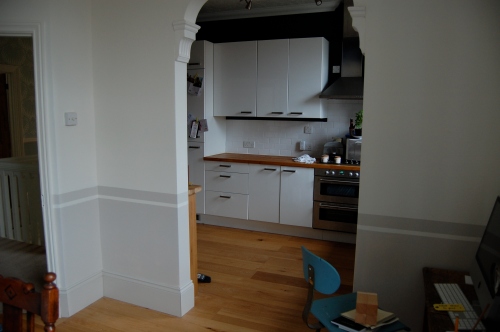
Once masked I filled in the colour, a pale red based grey so as not to battle with the strong navy in the kitchen.

DSC_0456


After two coats I gentled peeled off the masking tape to reveal my contemporary dado rail that cost less than £30 and only took half a day to complete! It was SO easy and has transformed my normally messy dining room into a rather respectable destination  to eat!

Note: Images below were post masking tape removal but pre tidying up!DSC_0460DSC_0459

Leave a comment

Filed under Ideas, Make it Yourself